
[[{“value”:”
Hey, The AI Break family 👋
Luis and Rui here, to bring you another cool tutorial on AI and Automation. In this issue, we’ll walk you through a powerful workflow that pairs a free browser tool with ChatGPT to give you a professional-grade CRO (Conversion Rate Optimization) audit in minutes.
Ready to improve your site and turn more visitors into loyal customers? Let’s go 🚀
(full prompt at the end!)

Using ChatGPT + a Free Tool to Supercharge Your Store’s Conversions 🚀
If you’ve been struggling to boost conversions, we have a simple, effective solution. Our approach uses just two tools:
-
GoFullPage (a Chrome extension to capture a full-page screenshot)
-
ChatGPT (your AI-powered CRO expert, ready to provide personalized feedback)
This strategy saved us hours and gave us tailored suggestions to improve our clients’ websites. Here’s the breakdown:
🛠️ Step 1: Capture Your Homepage
We started by installing the GoFullPage Chrome extension to capture a full-page screenshot of our homepage. It lets you:
-
Grab the entire page in one image—no scrolling screenshots needed.
-
Export your capture as an image (ideal for ChatGPT uploads).
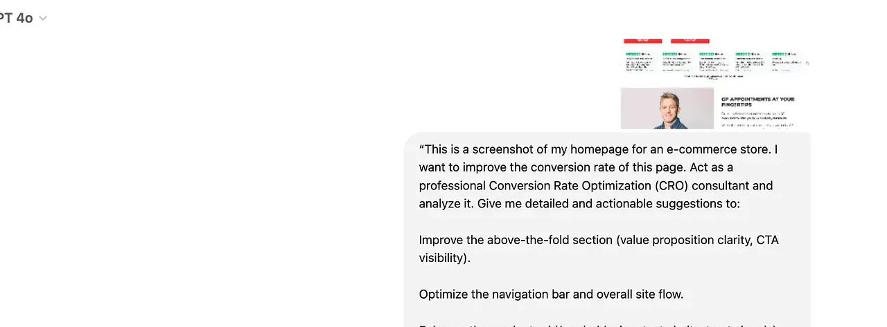
Once we got the screenshot, we uploaded it directly into ChatGPT.
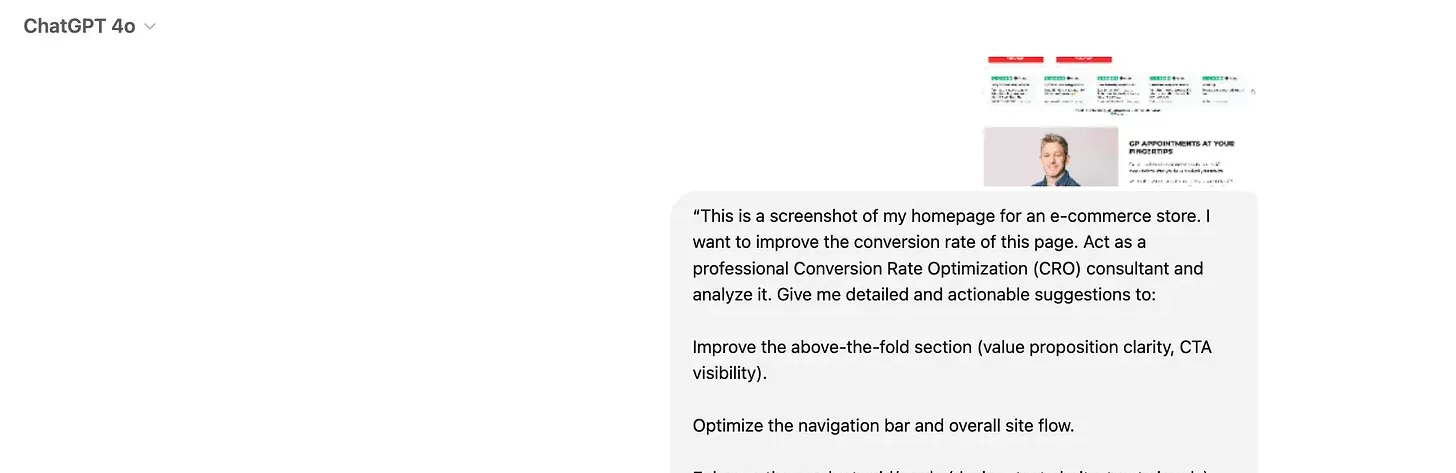
🧠 Step 2: Setting Up ChatGPT for CRO Analysis
Rather than asking for generic advice, we treated ChatGPT like a pro CRO consultant. We asked it for detailed, step-by-step recommendations on:
-
Above-the-fold messaging
-
Navigation flow
-
Product grid design and trust elements
-
Placement of social proof
-
The overall structure for smoother conversions
We’ll share this exact prompt at the end for paid subscribers, so keep reading if you want our ready-to-use template!
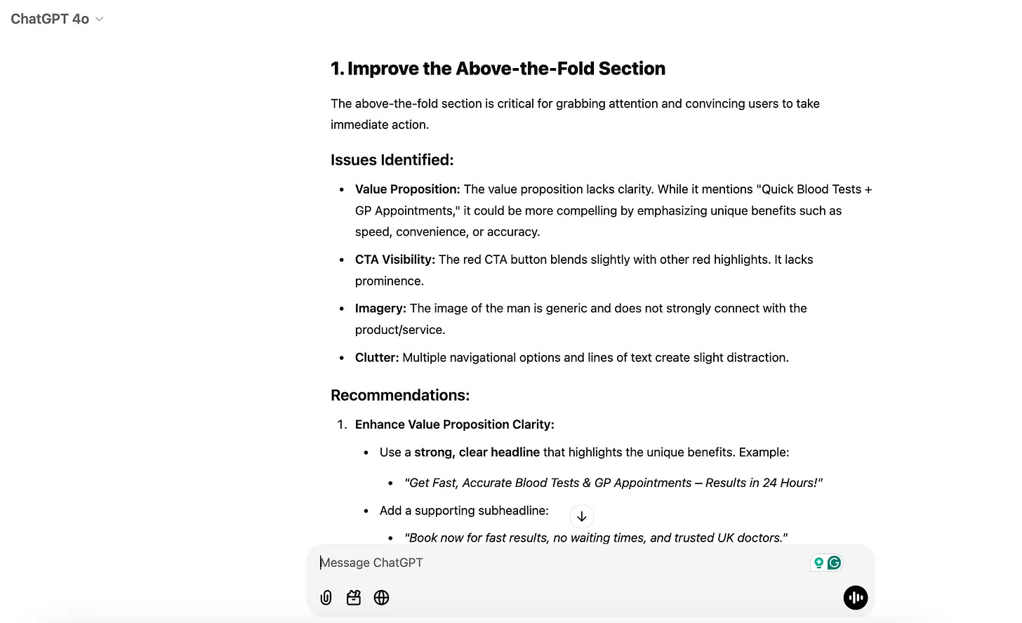
🎯 Step 3: The Detailed ChatGPT Feedback
With a well-structured prompt and the homepage screenshot, ChatGPT provided a surprisingly comprehensive audit. Here’s a deeper look at the kind of feedback we received:
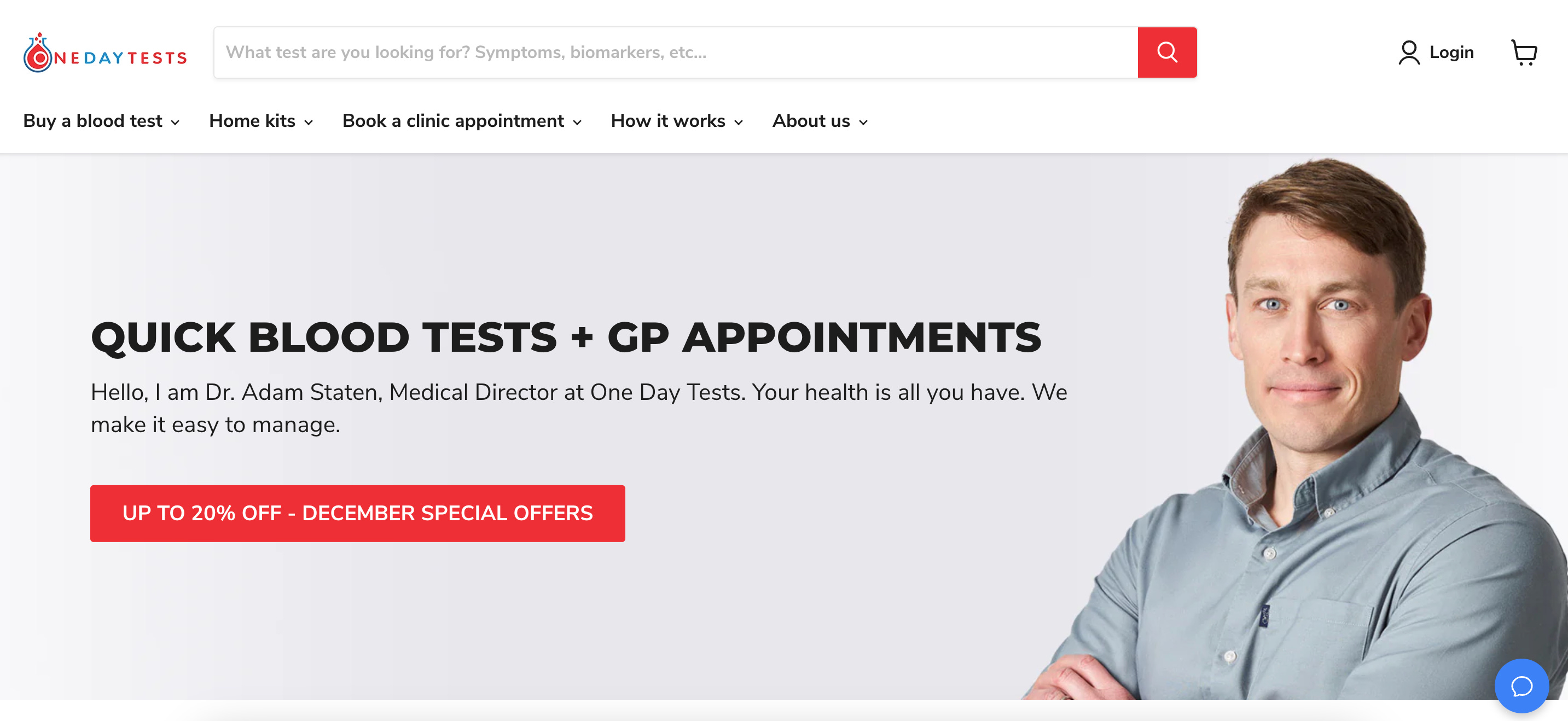
Hero Section Optimization:
-
Headline Clarity: ChatGPT suggested rewriting the main headline to emphasize our store’s unique selling point—focusing on specific benefits like “Get High-Quality [Product/Service] Delivered Fast” instead of vague taglines.
-
CTA Visibility: It recommended making the main call-to-action button stand out with bold, contrasting color and more direct copy (e.g., “Shop Now & Save 20%” or “Book Your Appointment Today”).
-
Value Props at a Glance: ChatGPT advised adding concise bullet points under the hero section to quickly convey our top benefits (e.g., “Free Shipping on Orders Over $50,” “Trusted by 50,000+ Customers,” “30-Day Money-Back Guarantee”).
Navigation Improvements:
-
Simplified Menu: It noticed we had too many menu items. ChatGPT recommended grouping related pages under drop-downs and using simpler labels (e.g., “Shop,” “How It Works,” “About Us,” “Contact”) to reduce clutter.
-
Prioritize Key Actions: Placing a “Shop Now” or “Book Now” button at the top-right corner of the navbar was suggested to capture immediate interest and guide visitors toward conversion-focused pages.
Product Grid Improvements:
-
Visual Hierarchy: ChatGPT suggested we use larger, high-quality images and add subtle icons or badges (e.g., “Top Seller,” “Expert Recommended”) to highlight standout products.
-
Clear Pricing and Benefits: It recommended short, punchy product descriptions that highlight key differentiators and trust signals (e.g., lab certifications, quality guarantees).
-
Consistent Layout: Ensuring uniform card design, font sizes, and spacing was advised to give a polished, professional look that’s easier for users to scan.
Social Proof and Trust Signals:
-
Testimonials Higher Up: ChatGPT proposed moving a short, impactful testimonial or star rating snippet closer to the hero section. This would immediately reassure new visitors that our store is credible.
-
Logos and Badges: It advised incorporating industry-recognized badges or media mentions right below the hero section. For example, “As Seen In [Publication/Platform]” or trust seals from well-known organizations to reinforce credibility.
Logical Page Flow:
-
Guided User Journey: ChatGPT emphasized structuring the page so visitors naturally flow from the hero section to key product categories, and then to detailed product pages, followed by testimonials, and finally a compelling CTA.
-
Scannable Sections: It suggested using subheadings, bullet points, and clear divider elements so users can quickly skim and find what they need, minimizing friction on the path to conversion.
📋 Step 4: Implement and Test
Armed with ChatGPT’s actionable insights, we:
-
Tweaked the hero section for immediate clarity and visual impact.
-
Cleaned up the navigation bar to guide users more intuitively.
-
Spruced up product grids with badges, improved descriptions, and consistent imagery.
-
Moved a compelling customer testimonial closer to the top of the page.
We ran A/B tests to measure the impact, and within days we saw improvements in our site’s user engagement—higher click-through rates and more add-to-cart actions.
🚀 Why This Works
By combining a full-page snapshot of our site with AI-driven insights, we got a tailor-made CRO roadmap without hiring an expensive consultant. It’s a quick, cost-effective way to identify and implement high-impact changes.
✏️ The Prompt
Here is the complex prompt we used to make this full analysis CRO to our client’s homepage:
“}]] Read More in The AI Break


